ToggleButton 은 버튼의 눌림을 표현 하는 방법으로,
한번 누르면 눌림상태로, 다시 누르면, 튀어 나온 상태를 말한다.
[Winform]
System.Windows.Forms 에는 별도의 ToggleButton 이 없고, 일반 Button 은 ToggleButton 처럼 사용할 수 없다.
System.Windows.Forms 의 CheckBox 나 RadioButton 의 Appearance 속성을 이용하여, ToggleButton 으로 사용할 수 있다.
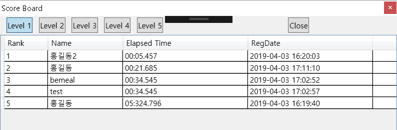
일단, Panel 위에 CheckBox 나 RadioButton 을 올려놓는다.
한 Container 위에서, CheckBox 는 여러개 선택이 가능하고, RadioButton 은 단 1개만 선택이 가능하다.
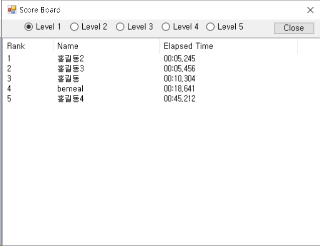
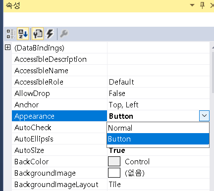
CheckBox 나 RadioButton Control의 속성을 보면,
Appearance 의 기본값 Normal 을 Button 으로 바꿔준다.
이제 버튼의 모양도 동일하게 보여지게 된다.
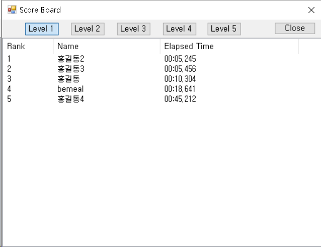
버튼의 눌림은 .Checked = true, 눌림해제는 .Checked = false 로 체크박스나 라디오버튼으로 그대로 사용하며,
화면에 보여지는 형식만 다르다는것을 알 수 있다.
[WPF]
WPF 에는 ToggleButton 컨트롤이 있어서, 바로 사용이 가능하다.
<ToggleButton Height="25" Content="Level 1" IsChecked="{Binding level1_checked, UpdateSourceTrigger=PropertyChanged}" Checked="ShowScore"></ToggleButton>
Winform 에서 Checkbox 로 토글버튼을 만든것과 동일한 결과를 얻을수 있다.
추가적으로, RadioButton 으로 컨테이너 또는 그룹 안에서 하나의 토글 버튼만 선택이 가능하게 하기 위해서는,
Winform 처럼 RadioButton 으로 구현하면 된다.
WPF 의 RadioButton 컨트롤의 Style 속성을 지정하여, 토글버튼으로 보여지게 된다.
Style="{StaticResource {x:Type ToggleButton}}"
<RadioButton Height="25" Content="Level 1" Style="{StaticResource {x:Type ToggleButton}}" IsChecked="{Binding level1_checked, UpdateSourceTrigger=PropertyChanged}"></RadioButton>
<RadioButton Height="25" Content="Level 2" Style="{StaticResource {x:Type ToggleButton}}" IsChecked="{Binding level2_checked, UpdateSourceTrigger=PropertyChanged}"></RadioButton>
<RadioButton Height="25" Content="Level 3" Style="{StaticResource {x:Type ToggleButton}}" IsChecked="{Binding level3_checked, UpdateSourceTrigger=PropertyChanged}"></RadioButton>
<RadioButton Height="25" Content="Level 4" Style="{StaticResource {x:Type ToggleButton}}" IsChecked="{Binding level4_checked, UpdateSourceTrigger=PropertyChanged}"></RadioButton>
<RadioButton Height="25" Content="Level 5" Style="{StaticResource {x:Type ToggleButton}}" IsChecked="{Binding level5_checked, UpdateSourceTrigger=PropertyChanged}"></RadioButton>
'개발팁' 카테고리의 다른 글
| 자바스크립트 javascript 로 string.format 함수 만들기 (1) | 2020.03.03 |
|---|---|
| 자바스크립트 (vue.js) 다이나믹 고정레이어 구현하기 (0) | 2020.02.16 |
| [C#] 파일시스템의 폴더감시 FileSystemWatcher (1) | 2019.03.19 |
| [javascript] 웹사이트에서 화면잠금 (ScreenLock) 기능 구현 (0) | 2018.12.26 |
| JavaScript json Object 초기화 함수 (0) | 2018.12.19 |

